

Written by James E. Kamis on 22April2015

Mount Pinatubo Eruption
Two recently released and independent studies both conclude that natural forces in the form of unusually strong and persistent trade winds are the cause of the 18.5-year global warming hiatus (see references below).
The implications are absolutely stunning!
- This is an admission that natural forces override / trump the effect of all man-made CO2 released into the atmosphere during this time period.
- It is also a very public admission by “consensus” climate scientists that the 18 ½ lack of atmospheric warming is real, not a fabrication of global warming sceptics. The research studies even coined a phrase to describe the lack of atmospheric global warming, the “Pause”.
- By stating that atmospheric temperatures have remained relatively constant for 18 ½ years climate scientists have essentially admitted that an important element of climate really hasn’t significantly changed during this time period. So the phrase “Climate Change” is not well supported by actual climate data, and some might argue misleading.
- Implementation of pending carbon taxes should be tabled until a more accurate measure of the impact man-made CO2 has on climate can be established.
- Political arguing concerning climate trends and solutions should be put aside thereby giving scientists room to do unimpaired and diverse research?
There are two important climate science questions not adequately addressed by this new research, leaving discussions of carbon taxes, politics, etc to others. The two questions are: Why did climate scientists fail to predict / model the “pause”, and secondly, what is the root cause of altered trade winds?
The short answer to the first question is that climate scientists failed to predict / model the “pause” because they were, and still are, atmospherically biased. For many years climate science has been stuck in a “it’s all about the atmosphere” mindset. This bias has blinded them. They have improperly interpreted or in some cases ignored mountains of compelling non-atmospheric data, much of it geological in nature, which would have aided in the prediction of the pause.
Scientific bias is more common than you might imagine. Formulating correct answers to well defined scientific questions can only be made when in possession of three elements: an open mind, sufficiently accurate data, and most importantly a parameter diverse data set of proper resolution. Amazingly when lacking any of these elements many of us, including scientists, still charge full speed ahead to what we deem are compelling answers. These answers then form the basis of how we perceive and judge the validity of the relevant scientific theory.
Sadly, and not to surprisingly hastily ill-formed answers are often proven incorrect. It then becomes necessary to alter our perception of, and confidence in, the relevant scientific theory. This is exactly what occurred when climate scientists prematurely pronounced the atmospherically based global warming theory proven.
This discourse may seem a bit esoteric, so to make it more tangible let’s test our own bias. This can be accomplished by reviewing two real world examples. This process will help clarify how scientific bias works. The first test / example is atmospheric and the second is oceanographic. In each case you will be provided with a map that clearly indicates an anomalous area. Your task is to determine two things from the map; 1.) Point source / geographic location of the anomaly, 2.) Cause of the anomaly. No tricks, no clever deceptions, these are real climate science maps.
Real world example one is as follows. Let’s take a shot at determining the point source location and cause of an atmospheric sulfur dioxide anomaly (bright red) as illustrated on the NASA satellite generated map (see figure 1). At first glance it looks like this may be an impossible task because there just doesn’t seem to be enough information on this map to formulate precise answers. However climate scientists often answer questions and judge theories on limited data, for instance utilizing just one key map or on key parameter.

Figure 1: Worldwide Atmospheric Sulfur Dioxide Concentration
Given that real world constraint let’s give it a shot.
- The anomaly source point is almost certainly within the mapped red anomaly band that circles the globe, possibly located just west of the South American Continent where the anomaly is widest.
- The geographic extent of the source point is likely very large because it generated an extensive worldwide anomaly.
- The event that created this anomaly is likely quite unique because it affects the entire world and is well defined. Anomalies are often thought of as unique and one of a kind.
- Lastly we could attempt to improve the existing map by digitizing all of the map contours and making a computer model from this digital data. This would yield very precise and hopefully more accurate maps. A precise and accurate looking map is often thought to be closer to the truth.
- The cause is difficult to estimate using this map, however knowing that sulphur dioxide is emitted from coal fired power plants we could at least say that fossil fuel pollution is a good candidate for cause.
If we feel reasonably comfortable with these real world answers, that's natural. Unfortunately we'd be wrong on all accounts. All of our answers are incorrect. Ouch! Not to worry because we are in good company. We all make these types of errors each day.
We are strongly affected by the seemingly accurate nature of brightly colored and well-illustrated maps that have precise lines and colors. They must be correct and all telling because they are so beautiful.
Time for a science reality check moment…in science, beauty is only skin deep. A beautifully precise map does not necessarily communicate the truth.
The map below (Figure 2) shows the correct answer to both questions. The atmospheric sulphur dioxide anomaly was generated by the 1991 eruption of the Mount Pinatubo volcano. It is not located within the mapped sulphur dioxide anomaly because currents quickly modified the position of the erupted sulphur dioxide ash plume by pushing into normal air circulation patterns around the earth.
The geographic extent of the Mount Pinatubo volcano is not large. Actually it is very small in comparison to its worldwide affect on atmospheric sulphur dioxide concentration and the resulting two year depression of worldwide temperatures. The base of the volcanic cone is approximately 5 miles in diameter. Although not a common event, eruptions on this magnitude happen fairly regularly especially when deep ocean eruptions such as “megaplume” eruptions are included in the data set.
Keep in mind 90% of all active volcanoes are on the ocean floor and most have not been monitored until very recent times, but only in the last 5 years or so. Generating a digital computer model wouldn’t have improved our chances of generating correct answers.

Figure 2: 1991 Worldwide atmospheric sulfur dioxide concentration with Mount Pinatubo Point Source location.
The primary take away from this atmospheric mapping resolution game is that data accuracy and resolution are vitally important to formulating correct answers to critical questions. Lacking this needed resolution we still incorrectly attempted to pick a point source and cause.
Next let’s review an ocean warm temperature anomaly example and try to discern both the point source location and cause of this high temperature anomaly. The only information we have is a NOAA Shallow Surface Temperature (SST) anomaly map from 1997 (Figure 3). At first glance this map indicates a very large high temperature shallow water anomaly across a large portion of the central Pacific Ocean (bright red). Our observations / answers from this might be as follows.
- The point source actually looks to be at least fairly predictable, because the bright red anomaly has a cone shape and the point of the cone located in the middle of the Pacific Ocean. This is likely the heat point source that warms the shallow ocean waters.
- The extent of the point source location is a bit tougher to determine, however as a guess it would likely be reasonably large to generate such an extensive sea water anomaly. After all it takes a lot of energy to heat a massive pool of sea water. We need a geographically extensive source point to accomplish this task. Map scale is difficult to tell, but as a guess several hundred miles across.
- This must be a very unusual event because the anomaly is sharp well defined and therefore unusual looking compared to other regions on the map. It is likely an infrequent and very unusual event.
- As before we could choose to digitize the contours of this map and use the data to generate a computer model. Maybe run time variations of the model. This would give us a number of various precise maps to aid us in making presumably more informed estimates of both point source location and cause.
- Lastly the cause is actually not to difficult a choice. It’s the atmosphere. The atmosphere is a logical choice because it is in direct contact with the shallow warm sea water anomaly. The atmosphere is also a geographically extensive energy source which fits well with an extensive SST anomaly. Climate scientists have been touting global air warming for years and they are the experts. Going to go with the atmosphere on this one. Feeling confident even though the map is low resolution, this conclusion seems logical, almost obvious.

Figure 3: 1997 NOAA Shallow Surface Temperature map (bright red is warm)
Well sorry to disappoint you again, however, but you'd be wrong on all accounts. Ouch times two.
The heat point source is located on the far eastern end of the map, just east of New Guinea (see Figure 4). This location is home to a tightly spaced group of active deep sub-ocean volcanoes and tectonic faults. It is much more likely that these geological features supplied the energy to heat deep ocean water immediately above these active geologic features.
This deep ocean warm cell was transported eastward and progressively shallower by ocean currents. Eventually this ocean warm cell became shallow enough to be recorded on shallow-water SST maps. So the central ocean point source point we choose utilizing the SST map is incorrect, and furthermore, the cause of this anomaly is not related to the atmospheric warming.
This is exactly what has happened to atmospherically biased climate scientists who have for years used SST maps to “prove” that increases in atmospheric temperatures are heating the ocean. With the admission that the atmosphere is not warming it is no longer a believable explanation.
It is more likely that the altered trade winds are not the cause of the global warming “pause”, but rather a side effect of an ocean that is warmed by deep ocean geological forces. A warmer ocean alters trade winds.
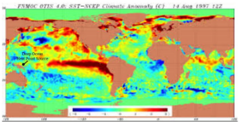
Figure 4: NOAA SST Map with Geological Heat Source Point
During the last five years, scientists have amassed a better data set with increased accuracy, tighter spatial distribution, more diverse parameters, and representing a longer time period. Utilizing this new data set the mindset has changed from believing in “climate change” to believing in the need to “change the climate theory.” Clearly geological forces have a very strong impact on climate including the relative influence of man-made CO2 and the altering of trade wind patterns. This has strengthened many Plate Climatology Theory principles.
With a clear and open mind, a sufficiently accurate data set, and most importantly a data set of proper resolution it can now be stated with confidence that “Geological Forces Trump Man-Made Global Warming.”
References
http://www.upi.com/Science_News/2015/04/14/Pacific-Ocean-responsible-for-global-warming-slowdown/7201429042739/